“Product Design Lead • Huge • 2016”
My role in brief
- Worked within and set direction for a team of 3 designers
- Audited existing site, competitor experiences, and wider digital landscape
- Planned and carried out field research across four European markets
- Defined target audience in form of behavioural personas
- Distilled observations and findings into experience strategy for the project
- Planned, oversaw, and analysed user testing
Under the brand megabus.com, Stagecoach have been operating low-cost intercity coach travel for customers since 2003. Initially serving only select routes in the UK, the operations soon expanded to include North America and eventually mainland Europe.
In 2015, coinciding with a bigger push into the European mainland markets, Stagecoach partnered with Huge to redesign and expand the digital offering for megabus. To stand out from a field of competitors, who all compete on price, megabus.com needed to deliver an experience that set them apart.
Going into the field
We spent 6 weeks doing extensive research to understand the business, customers, and nuances to the different markets.
To get a balanced picture, we focussed on a number of key markets with varying degrees of maturity:
In Europe, those markets were the UK, France, Germany, and Italy.
Coordinating with some of our offices in the US, we expanded our research efforts to include New York City, Chicago, Orlando, and Los Angeles.
We conducted heuristic, statistical and landscape analysis to ensure no stone was left unturned. For our remote research we recruited megabus customers for mobile travel diaries which resulted in 162 responses from travellers in the US and Europe.
Visiting bus stops in the chosen markets allowed us to not only talk to people at the start and the end of their journey with megabus, but also experience intricacies unique to some of the stops first-hand.
Together with another experience designer I visited stops in London, Berlin, and Florence. In addition to travellers we also got to speak to staff on the ground, including drivers, service personnel at the desks where available, and even back-office employees monitoring operations for the local market.
A valuable insight was that not only customers would benefit from a redesigned experience, but ground staff as well. Expanding the digital ecosystem to include staff-specific tools would empower them to serve customers more efficiently, for example, speeding up boarding through digital ticketing or being able to process instant purchases at the bus.
Megabus, meet your customers
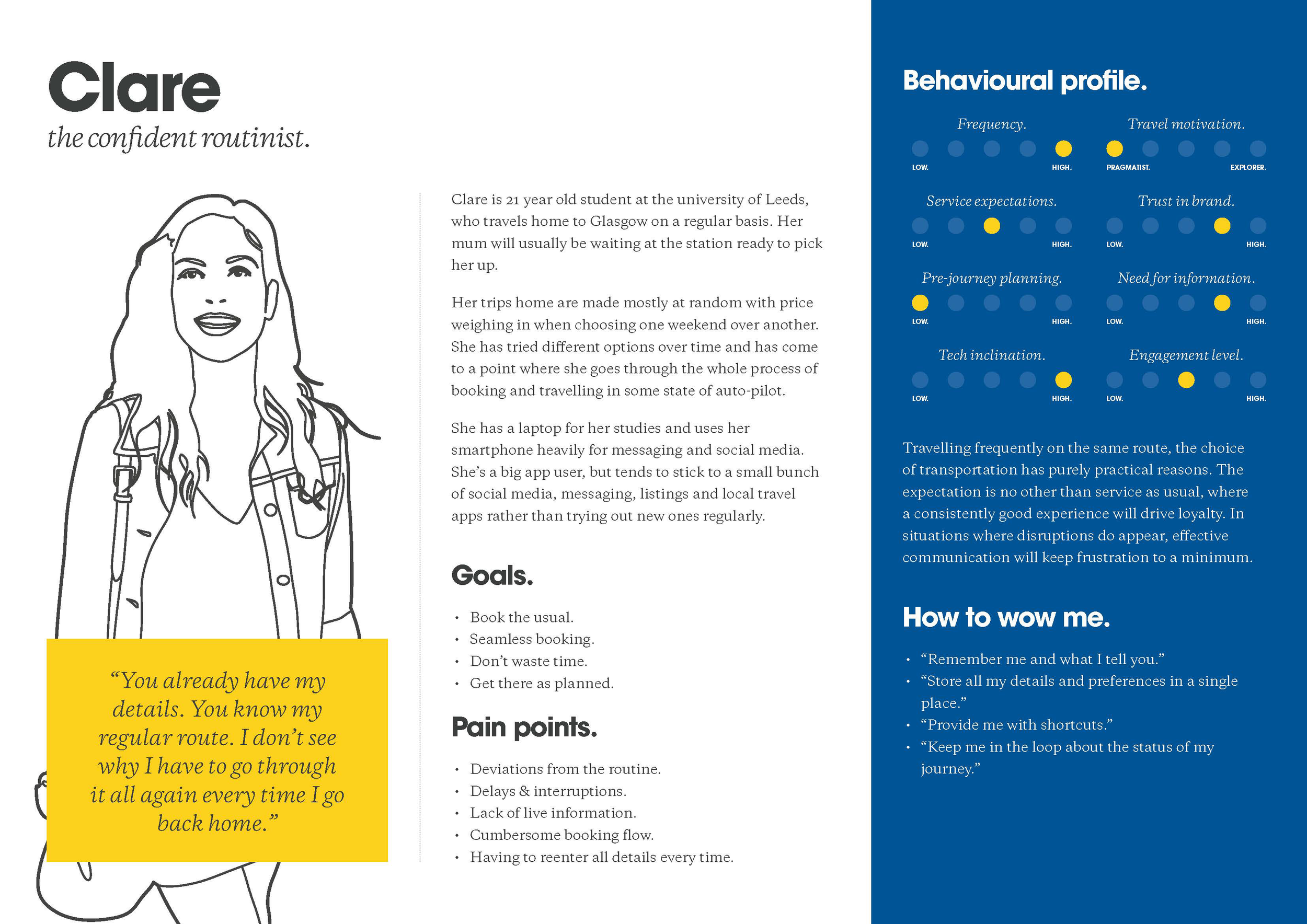
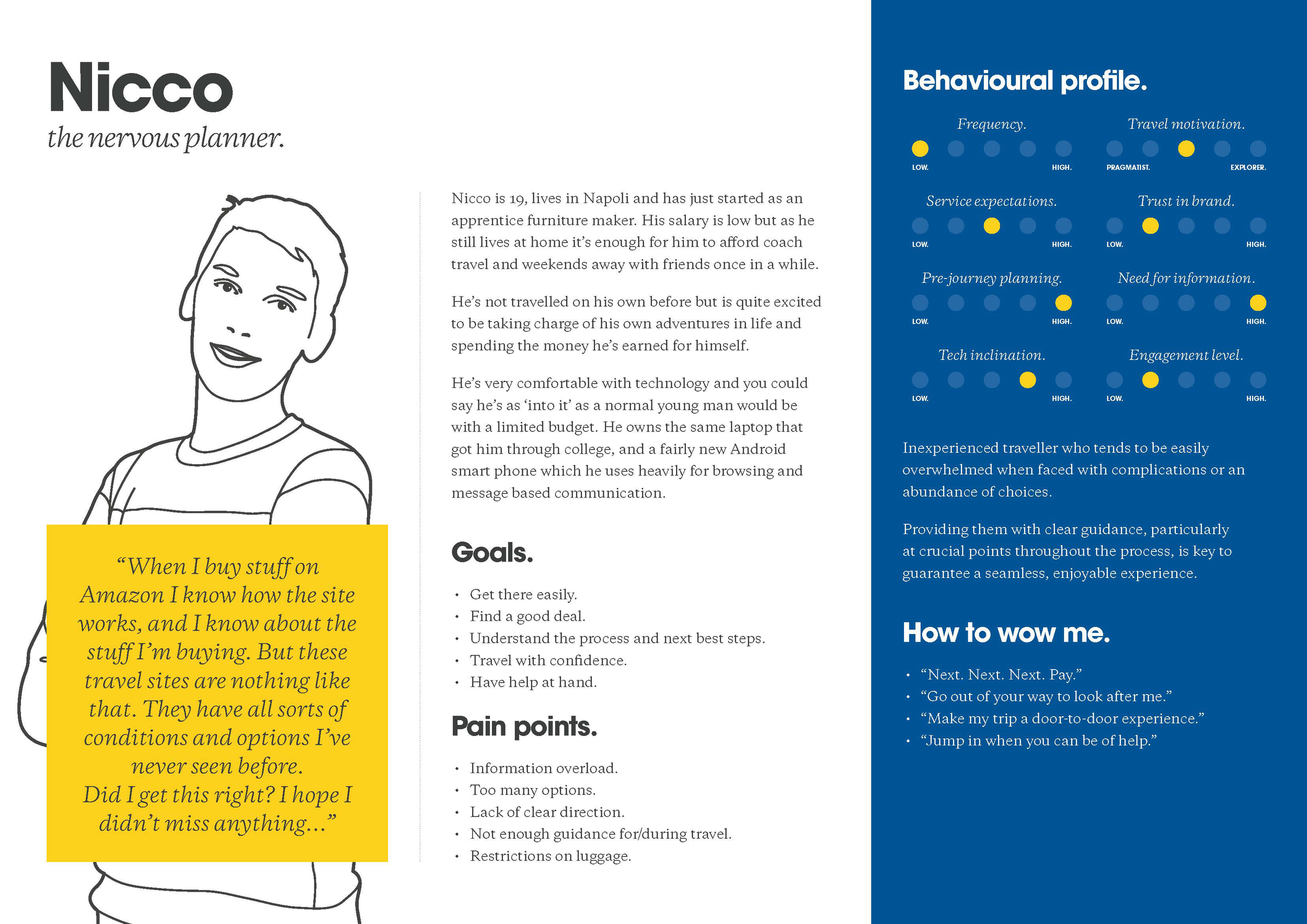
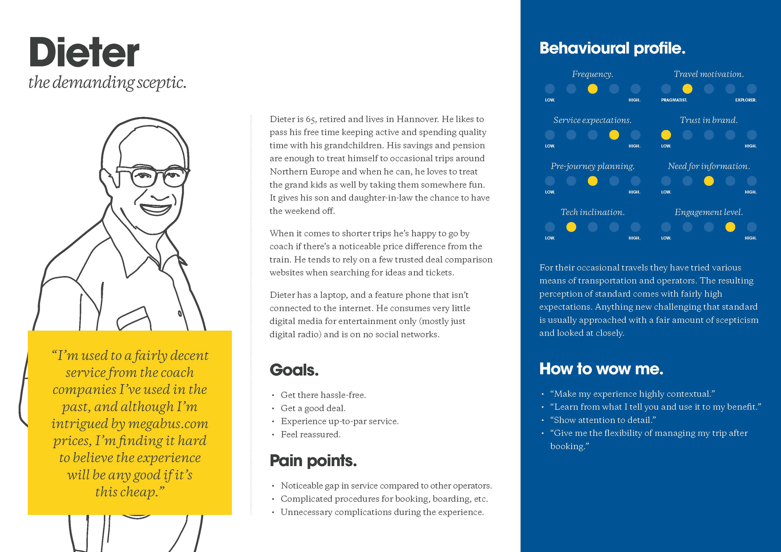
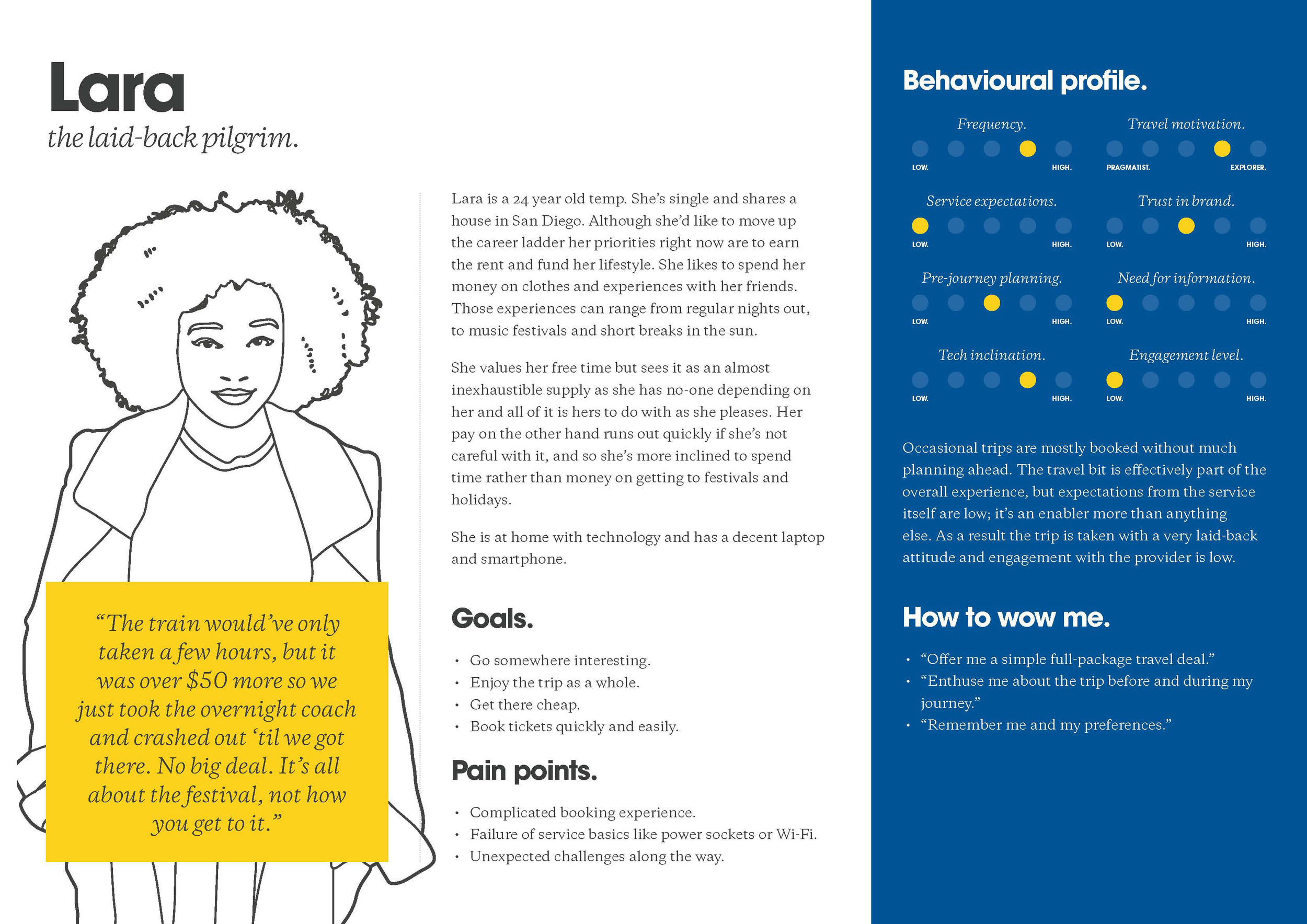
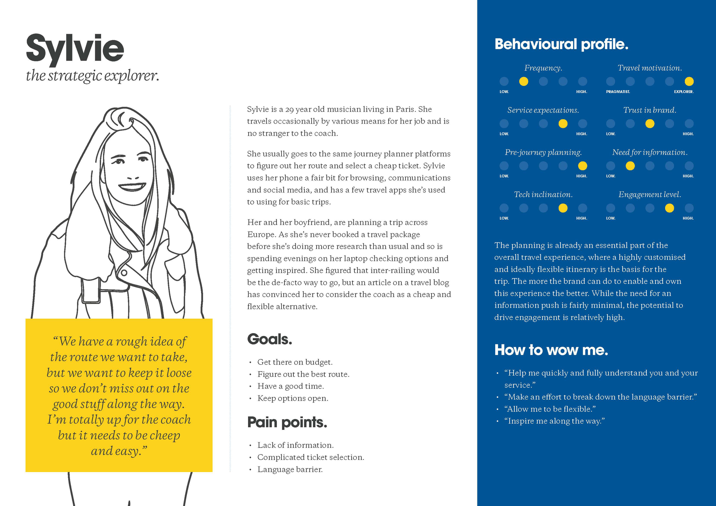
To aid identifying our audience, I defined a set of behavioural parameters relevant to the problem space. Based on these parameters five distinct behavioural profiles evolved, which I broke down into one primary persona, three secondary personas, and one persona in the growth category.
Illustrating the omni-channel vision for the larger group of stakeholders, I mapped the personas’ respective journeys in a hybrid of current and future state experience. The maps were designed to capture both recognised pain points as well as identified opportunities for improvement.
Customer journey map for Dieter, the Demanding Sceptic
More than just a means of transportation
For the renewed megabus.com experience we envisioned a truly end-to-end service that understands a traveller’s needs at all stages of their journey, from researching destinations to booking tickets and finding their way to the bus stop to entertainment en route. The platform would take into account the context users were in at any given time, allowing megabus to anticipate and cater for the changing needs.
From a traveller’s point of view this would entail being presented with a highly adaptive site that transitions from an inspirational travel hub to a smart companion tool once preparing for and embarking on their trip. Instead of ‘where to go’ the site would be all about ‘what to pack’ and ‘how to get there’ once a purchase is made. ‘When should I leave?’ becomes ‘when do I get there?’ on and throughout the day of travel.
Iterative design and testing
The existing site looked and felt outdated, quite clunky, information heavy and overall not very appealing. We pushed for a refreshed visual style to make the experience feel more modern and inviting. Based on the new styleguide we iteratively designed, built and tested experience prototypes of varying fidelity to validate our ideas.
At least two of us were present for the tests at any time to get first-hand feedback and be able to resolve bugs right away that would have otherwise distracted other participants. Feedback from test participants helped to understand the kind of questions users are faced with as they go through their booking process, allowing us to cater towards those friction points with subsequent versions.